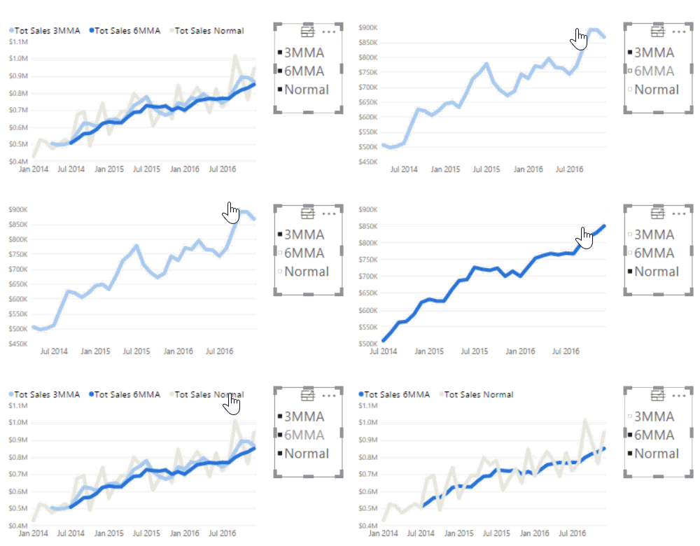
Say a customer wants a line chart with a sales line, a 3 month moving avg, a 6 month moving avg, a 12 month moving average, and a same period last year series. You being a DAX Titan can whip those out quick, no problem. But when you through them all on a chart, it suddenly looks like a drawer full of power cables; so many lines you can’t tell one from another. Wouldn’t it be nice to let the user be able to add and remove whichever measures they want with a simple click, or add only the two they want to compare resulting in a nice uncluttered chart?
In this video we’re going to show you how to do that nice and easy with a combination of a teeny tiny disconnected table and the CONTAINS() function.
Give this guy a watch, your report consumers will love it. 🙂


