Google has created Material Design, a design language for mobile and web applications. From color palette, position and size of elements, to user interactions and state transitions, Material Design provides a solid framework for any application.
In addition, Google has been hard at work creating an Angular module called Angular Material. This module provides app developers with some nice components with Material Design behavior baked in. If you’ve been leveraging Twitter Bootstrap and UI Bootstrap in your Angular applications like we have, you’ll want to consider Angular Material for future applications.
I’m going to provide you with a brief overview of what Angular Material offers, but I encourage you to go look at the project demos and test it out. You won’t be disappointed.
Exploring Angular Material – Directives For All
Nearly all Angular Material features are enabled by using the appropriate directive. Need a toolbar? Use the md-toolbar directive. Need side navigation? The md-sidenav directive has got you covered.
Each of these directives has a base style. When you use an Angular Material directive you’re not only applying an appearance and layout, but also any user interactions/behaviors and state transitions that have been defined for that type of component.
A More Fluid Grid
For years we’ve heard that flex or flexbox would simplify our layouts and now we finally can start using display: flex; in the latest browsers.
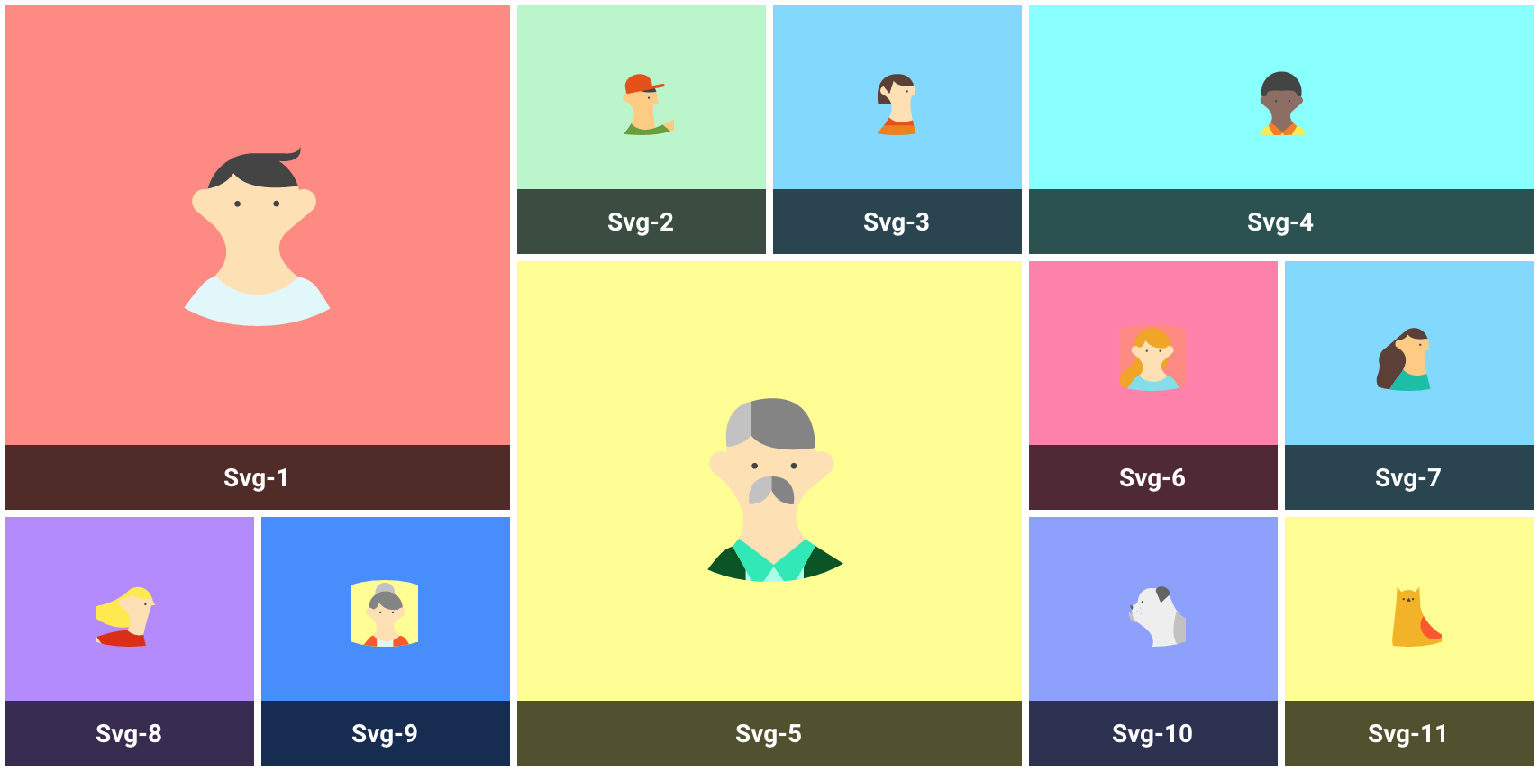
Angular Material‘s implementation provides some attribute directives to configure the number of rows or columns each tile will occupy. The md-grid-list demo shows how easy it is to set up a collection of tiles.
Common UI Elements
Angular Material provides some nice enhancements to some of the pain-points in application development. Things like input fields, checkboxes, radio buttons, and select boxes have all been re-implemented in simple-to-use directives.

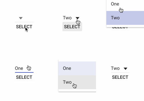
md-select along with md-option not only look great on any device but follow the same coding pattern as the standard HTML select element.
<md-select ng-model="someVal">
  <md-option value="1">One</md-option>
  <md-option value="2" ng-selected="selected">Two</md-option>
</md-select>
<md-button ng-click="selected=true">Select</md-button>
Dialogs & Toasts
We’ve been notifying with toast notifications when records are saved or potential problems arise. It’s important to keep the user informed.
With Angular Material‘s toast notifications you not only keep users informed, but you can include actions for the users to complete. Include the $mdToast service in your controller and configure your message like this:
_this.showToast = function () {
    $mdToast.show(
        $mdToast.simple()
          .content('Simple Toast!')
          .position('top right')
          .hideDelay(3000)
    );
};
$mdToast.show() can also take a controller and template path to have a custom toast message with varying functionality.
_this.showCustomToast = function() {
    $mdToast.show({
        controller: 'ToastCtrl',
        templateUrl: 'toast-template.html',
        hideDelay: 6000,
        position: 'top right'
    });
};
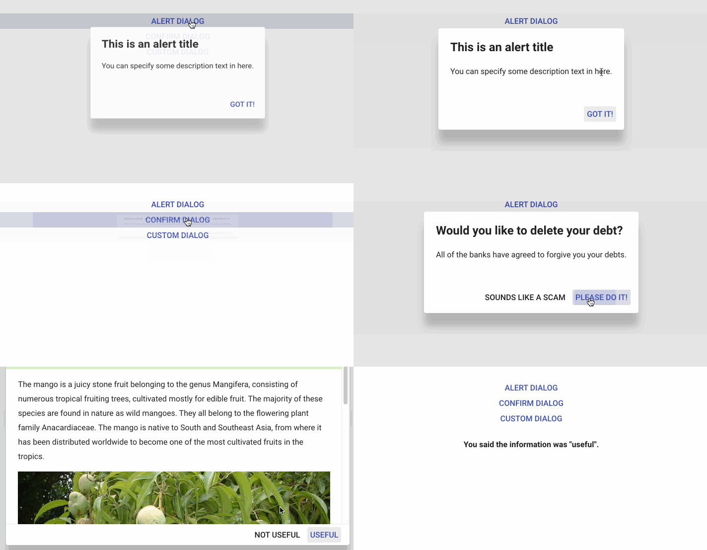
Modal dialog windows help keep a user on one view while completing an action for another. Angular Material provides Alert, Confirm, and Custom dialog templates.
Similar to $mdToast, $mdDialog is an easy-to-use service that allows you to define your modal dialogs within your controller like this:
_this.showAlert = function(ev) {
    $mdDialog.show(
        $mdDialog.alert()
            .parent(angular.element(document.body))
            .title('This is an alert title')
            .content('You can specify some description text in here.')
            .ariaLabel('Alert Dialog Demo')
            .ok('Got it!')
            .targetEvent(ev)
    );
};
Similar to the custom toast message above, $mdDialog.show() gives you a way to set a controller and template for your modal dialog.
_this.showAdvanced = function(ev) {
    $mdDialog.show({
        controller: DialogController,
        templateUrl: 'dialog-template.html',
        targetEvent: ev,
    })
    .then(function(answer) {
        _this.alert = 'You said the information was "' + answer + '".';
    }, function() {
        _this.alert = 'You cancelled the dialog.';
    });
  };
How to Get Started
This post has barely scratched the surface of what’s possible with Angular Material. I encourage you to explore the demos yourself. If you want to start hacking on some code right now, fork one of these pens and have fun. There’s also the ‘Material-Start’ repo on GitHub. Also, checkout the Build an Angular Material App presentation from ng-conf 2015, presented by members of the Angular Material team.
If you have questions, please leave them in the comments.


