“Fostering a data-driven culture” has been overused to the point of losing its meaning. If you have big data-driven dreams, solving problems collaboratively is the only way to get there.
Some of the most consistently challenging components of realizing a data-driven culture is getting to the requisite…behavior changes and collaboration. Taking a report or dashboard that last mile from “done” to valuable is a fraught path. You need some solid strategies for walking it.
Usage vs. User Adoption with Data and Reports
I want to take a quick detour to talk about a distinction we’ve started making internally between usage and user adoption.
Last year we built a leadership dashboard for one of our clients. The dashboard was meant to replace a manual report that our client painstakingly built for a monthly leadership meeting. We regularly look at usage metrics to monitor dashboard/report adoption and identify improvement opportunities for underutilized reports.
Microsoft just announced an improved usage dashboard and metrics that will enable you to more closely track usage across all environments: Power BI direct, embedded, and mobile.
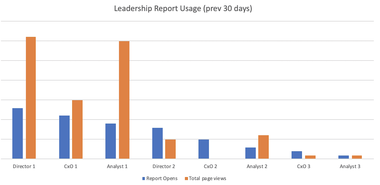
Here’s a rough approximation of what we saw:
It’s fairly straightforward. You can see there are a few people looking at it fairly regularly (report opens) with a reasonable amount of depth (total page views). A few others are looking at it less regularly with less depth.
What you are not seeing here is the ~10 other members of the leadership team who had access to the report but weren’t using it. When we surfaced this to our client, we rolled out a couple of working definitions for usage and adoption.
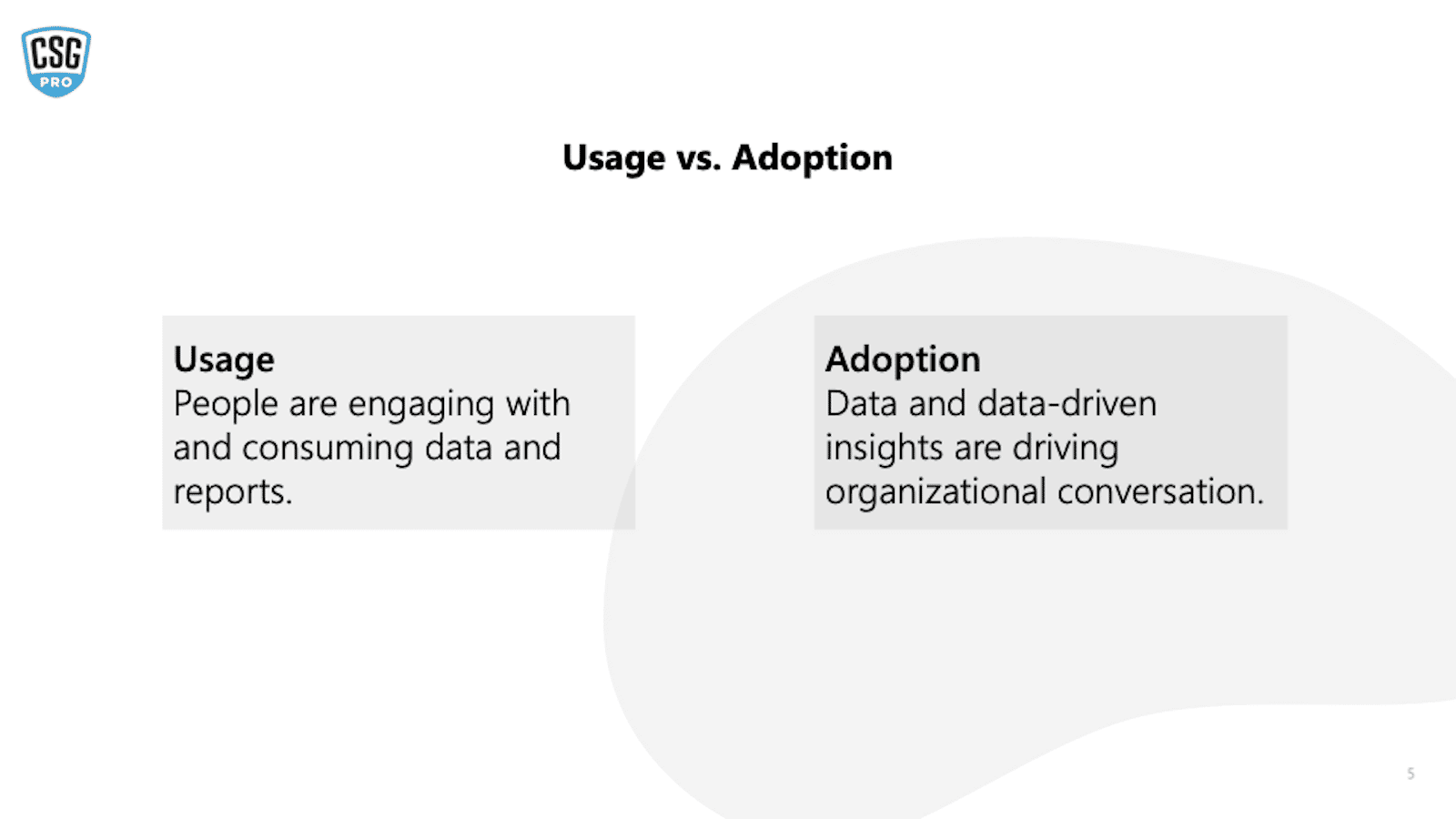
With usage, people are engaging with and consuming data and reports. Versus adoption, where data-driven insights are driving organizational conversations.
With these definitions, users could meet the requirements of usage while being fairly passive and/or individually focused. Meeting the definition of adoption required working and collaborating with others.
Under this paradigm, the report opens and page views were good indicators for usage. However, for user adoption, we wanted to focus on how many people were accessing and using these dashboards. High adoption rates indicate that the dashboard was relevant and valuable to its audience.
Make Sure Your Consumers Can Consume
Getting good usage is a necessary step to user adoption, it also requires that your consumers can do the thing that you’re asking them to do. Which sounds a little flip, but let’s unpack it.
Do your consumers feel comfortable using Power BI (or your organization’s BI tool of choice)?
If their experience is limited to seeing you (an expert) play in the tool, they might need some basic 101 before they’re ready to engage with what you’ve built.
People also have different schedules and learning styles. Recently we have taken to recording more orientation and demo videos. When people have a few minutes to spare, they get a guided tour of reports at their convenience.
Measure Your Muffins
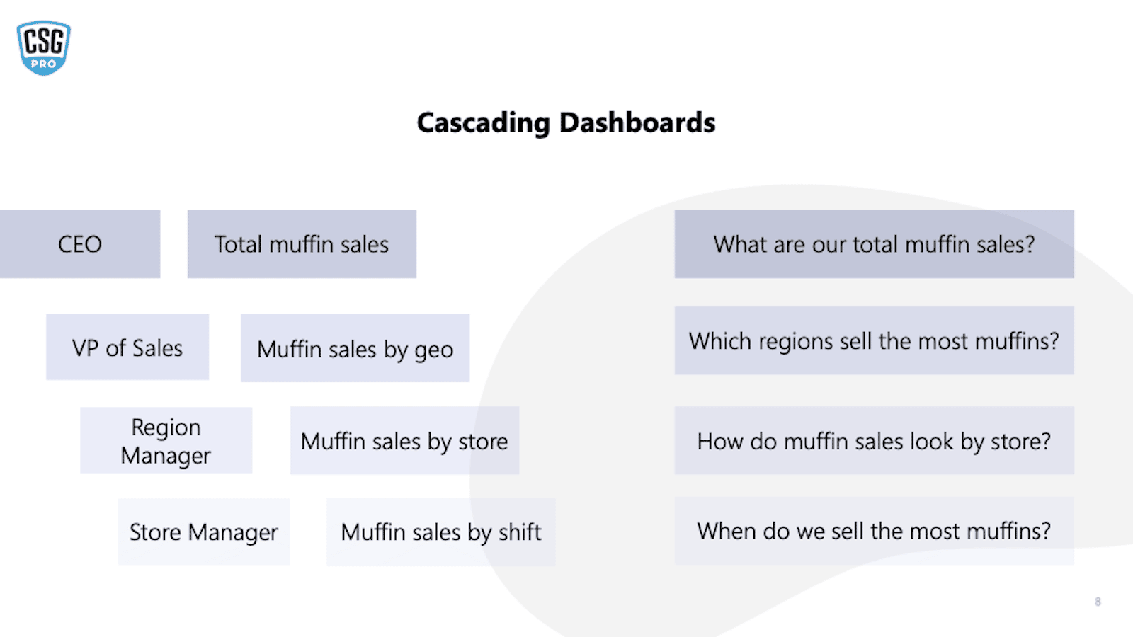
One of the key concepts for Balanced Scorecards and Enterprise Performance Management is cascading dashboards (or reports). The essential idea is that there is a strategic throughline in what’s important to your organization and what you’re reporting on.
Imagine you are the CEO of a national coffee store. You know that muffins are a high-margin business and you want some muffin market share.
- If you’re talking to your VP of Sales, you’re going to want muffin insights from them.
- Your VP of Sales will want muffin insights from their Region Managers.
- Region Managers will want muffin insights from the store managers.
As a manager, you are taking steps to align organizational goals to the things you choose to measure. If you are consistently asking questions about specific muffin metrics, over time people will start engaging with those metrics. If an entire leadership team starts modeling that behavior, you will see rapid changes start taking form.
Also, just as a preemptive note, cascading dashboards are not about 100% overlap or about a dictatorial method of management. Information should flow both ways! If your store manager is saying that muffins are not selling in Hawaii but iced tea is moving numbers, you likely want to know that. But everyone should also be aware of and aligned to organizational goals so that they can contribute to them.
Additionally, if you do not have a consistent strategy, people will choose their own metrics. If you started this process at the bottom with the store manager, they may want to highlight areas where they’re killing it. But at some point, somebody asks about muffins and nobody knows the answer.
As conversations and decisions increasingly center around relevant dashboards and data, it leads to more questions and analysis that leads to more people collaboratively solving problems. This is ultimately the goal of any data-driven culture dream.
The Skypoint CSG team is here to help your team achieve your data-driven dreams. Reach out.


